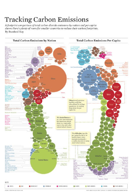
I like this multimedia presentation too, from a Basque information service. We were in Basque Country this summer on vacation. Beautiful place with wonderful people. Who knew that they did such great graphics on climate change?

I like this multimedia presentation too, from a Basque information service. We were in Basque Country this summer on vacation. Beautiful place with wonderful people. Who knew that they did such great graphics on climate change?